Below you can find the template builder's functionality divided into sections:
1. Content
- Columns - have the same set of adjustments as rows (described in the below section)
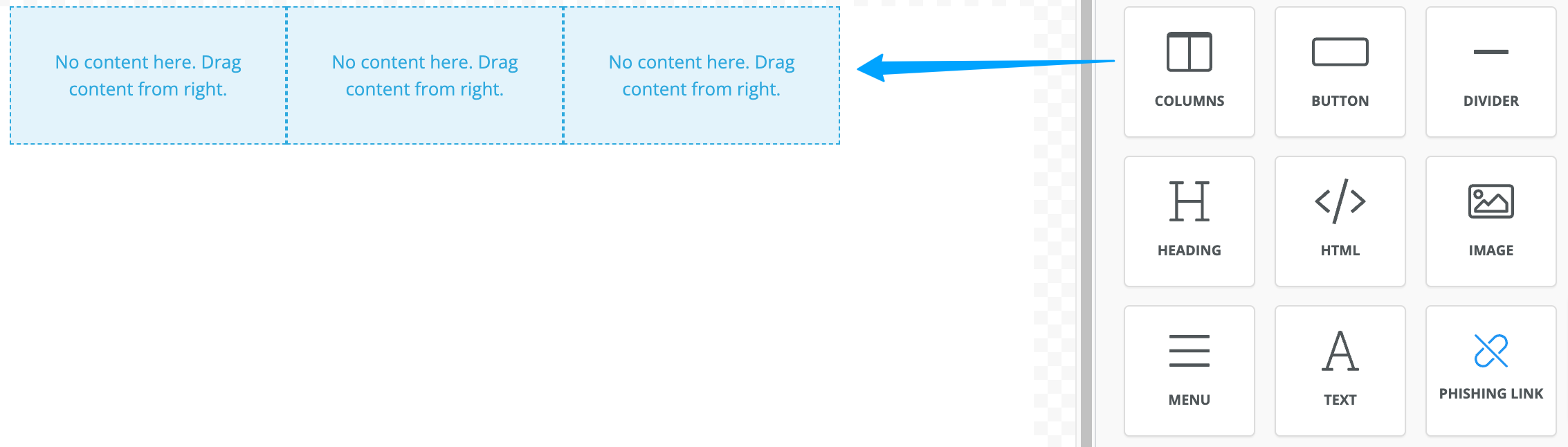
- Button - has an editable name, can either open a new tab (or use the current tab) leading to a specific website or can contain a phishing link. The button has text, background color adjustment options alongside spacing options (border/padding)

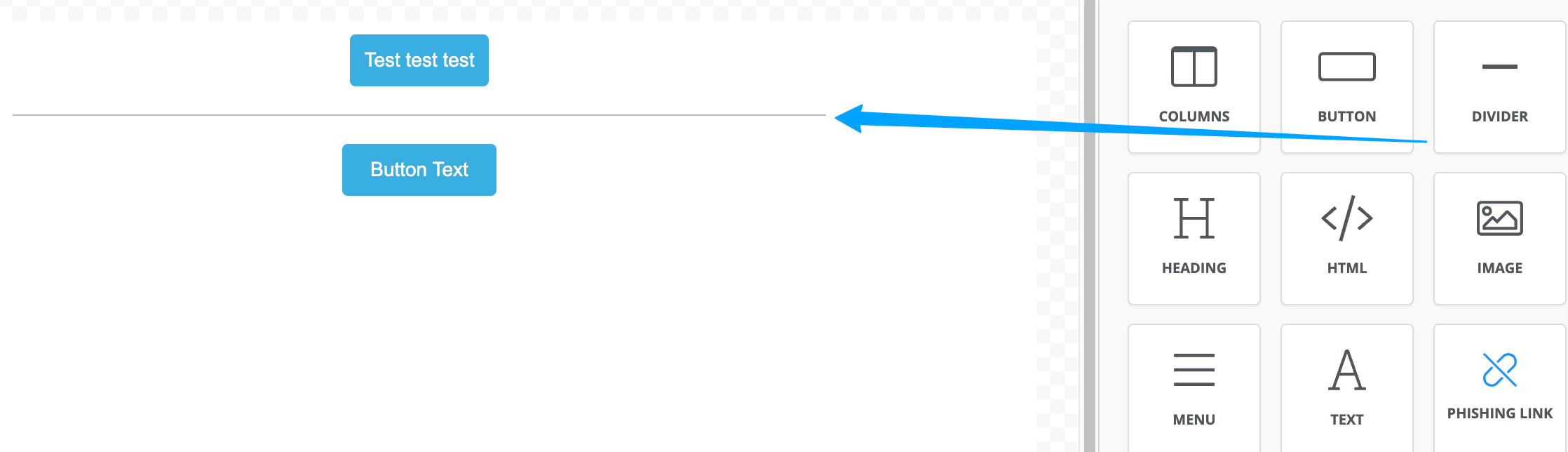
- Divider - used to divide elements more visibly
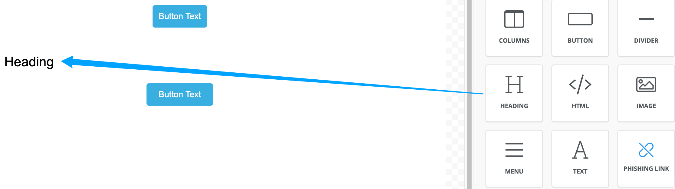
- Heading - has adjustable type (H1-H4), font, color, text alignment, etc.
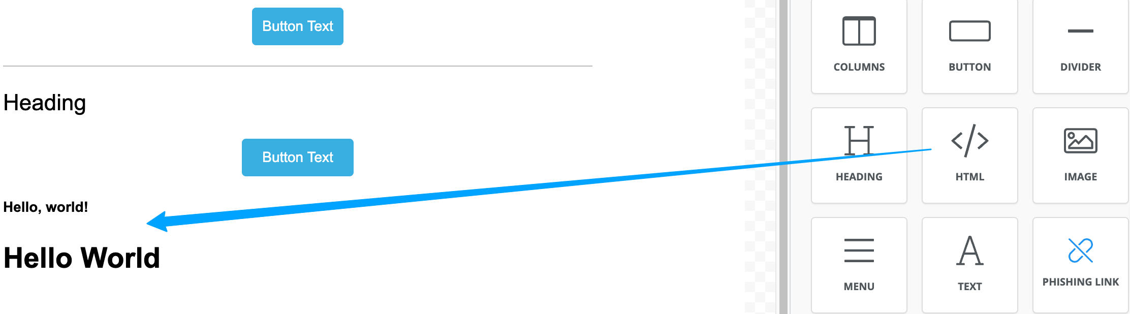
- HTML - allows adding content via HTML code
and as a sample: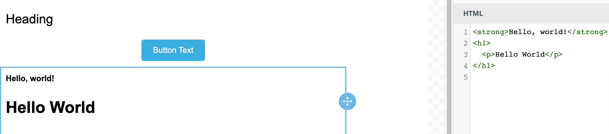
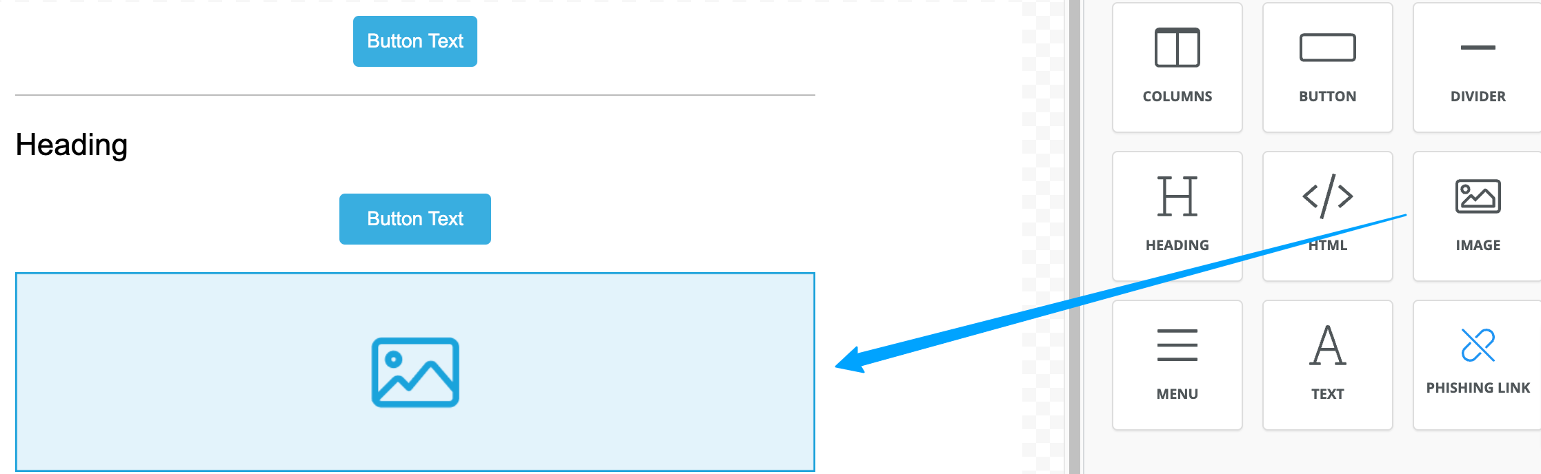
- Image - allows adding desired images to the email content either by uploading or pasting the URL, with the additional possibility to set opening the image in the current/new tab, alignment & adding alt text.
- Menu - allows adding menu items that can open desired URLs or can contain phishing links, menu items are customizable in terms of fonts, alignment, padding, layout, etc
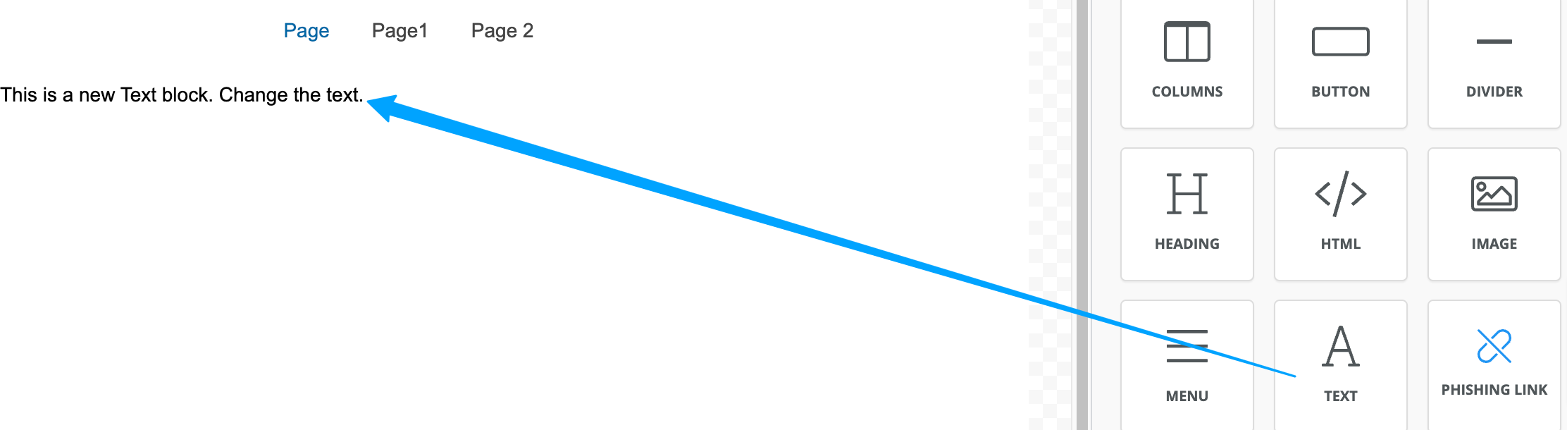
- Text - allows adding a text block & customize it according to your needs.
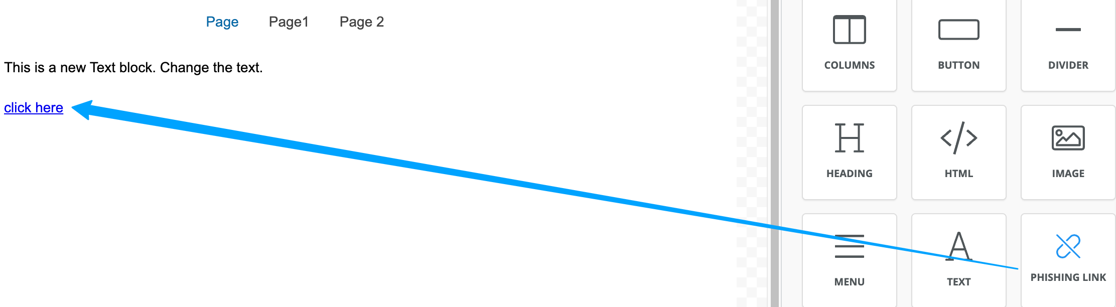
- Phishing link - allows adding a separate phishing link.
2. Blocks
This section lets you edit the template by adding the blank blocks of content which are yet to fill with desired content: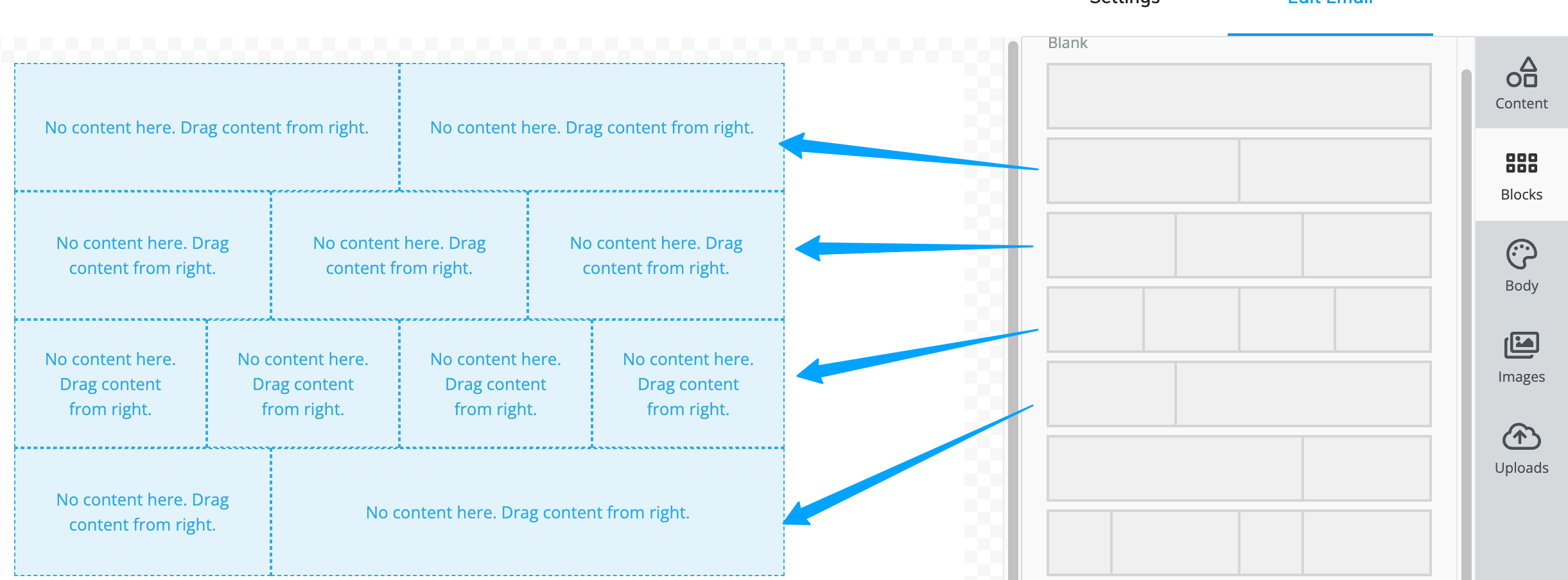
Each row inside the blocks is editable and can be adjusted according to your needs, can be duplicated, and be previewed from either desktop or mobile modes: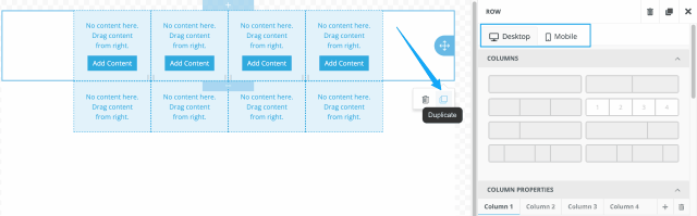
Each of the columns inside the rows can be editable according to your needs as well.
The below options are available:
Column properties:
- Background Color - adjust the background color of a specific column.
- Padding - adjust the padding of a specific column.
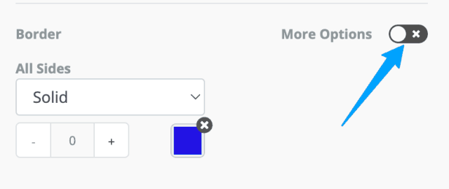
- Border - adjust the border of a specific column. (In case you would like to adjust the border for a specific side, press on More Options as shown below)
Row properties:
- Background Color - adjust the background color of the row
- Content Background Color - adjust the background color of the content in a specific row
- Background Image - upload a background image or use the drag & drop option.
- Image URL - provide a link to the desired image instead of uploading
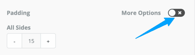
- Padding - adjust the padding of the row. (In case you would like to adjust padding for a specific side, press on More Options as shown below)
Responsive design:
- Hide on desktop - you can choose to hide blocks on desktop devices.
3. Body
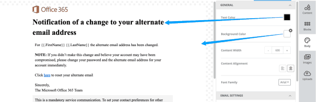
General section:- Text color - defines the color (choose from a color palette) of the text to be used in the template.
-
Background Color - defines the color (choose from a color palette) of the background to be used in the template.
- Content Width - defines the overall width of the content in the message.
- Content Alignment - provides an option to align the content of the message, available options are center-aligned and aligned to the left.
- Font Family - defines the font used for the text in the message
Reference example below:
Email settings section:
- Preheader text - a preheader is the short summary text that follows the subject line when viewing an email from the inbox.
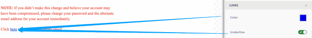
Links section:
- Color - define the color in which the hyperlinks will be highlighted.
- Underline - define whether the hyperlinks will be underlined.
Reference example below:
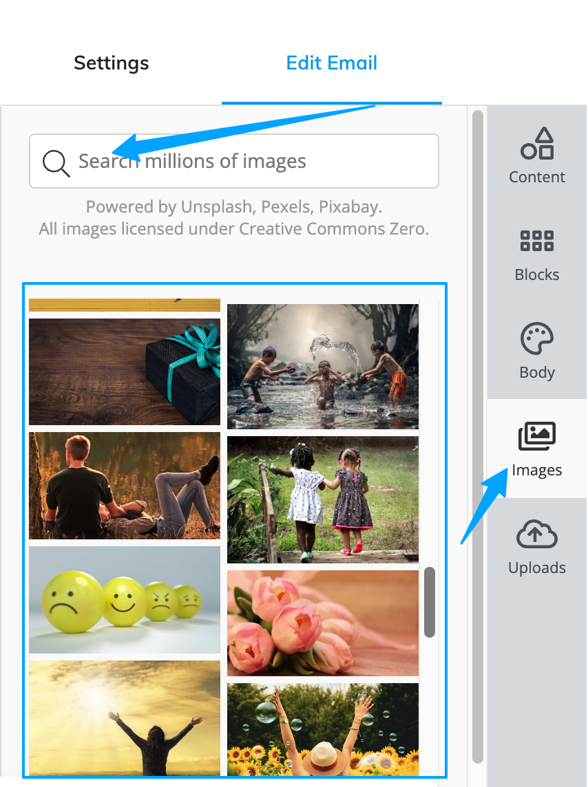
4. Images
- Provides an option to search for the desired images:
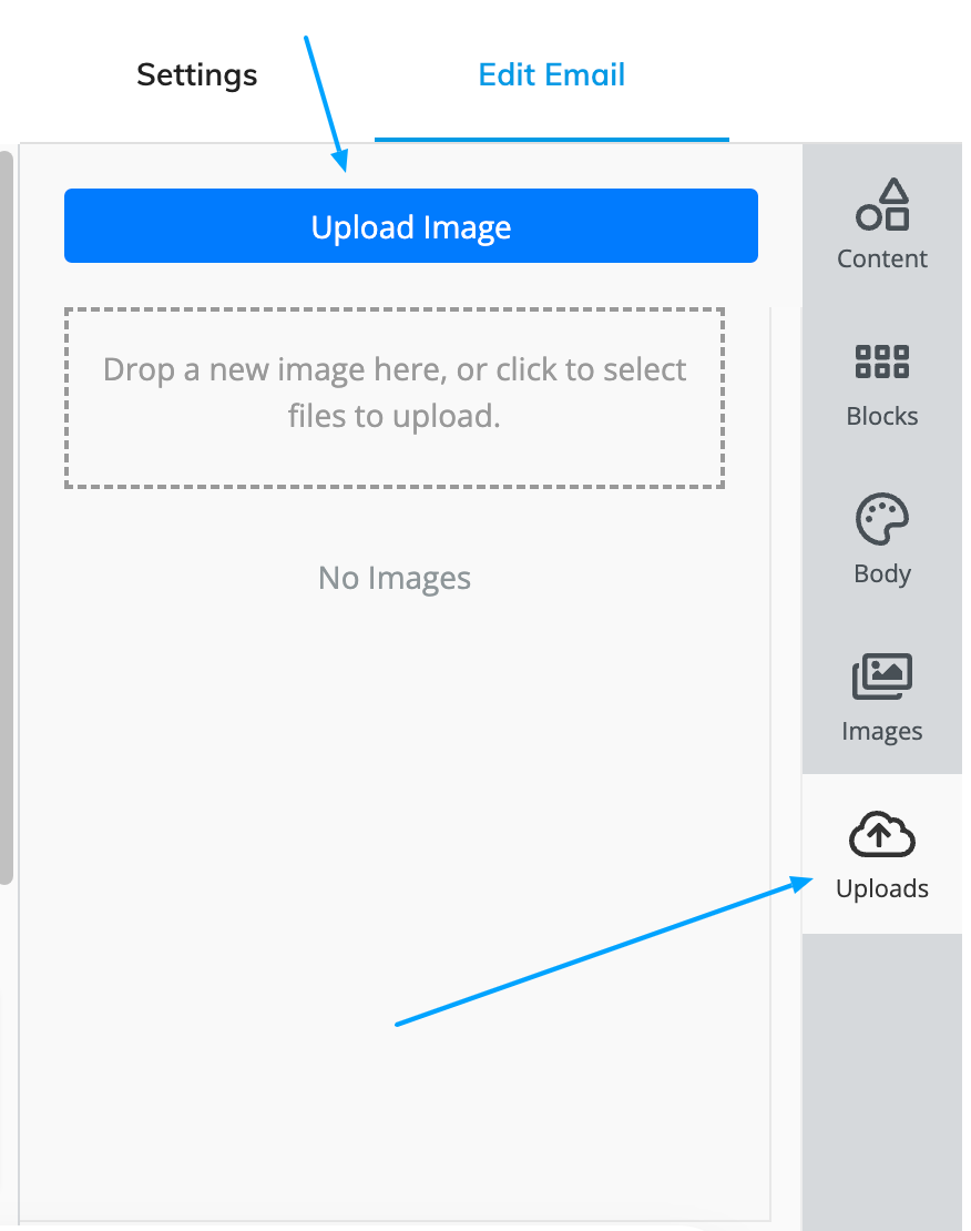
5. Uploads
- Fairly straightforward allows upload of desired images: